My logo has always had a circuit board feel: clean lines, sharp corners and little joints where things connect. For a long time my website did not really carry that through. So this autumn I did a full brand overhaul. The logo, colours, type, icons and circuit details now follow one simple design system, and I have written it up as a short brand booklet.
The short version
One logo, one idea. Every page now looks like it was drawn on the same circuit board.
The brand overhaul in ten pages
Here is the whole brand in ten short pages: the idea, the logo, colours, type, the circuit kit, icons, corner motifs, landmarks and the rules for using it all. Nothing complicated. Every new page, drawing or button follows the same few rules, so the site stays consistent as it grows.

guidelines
One idea.
The JC logo is built like a circuit board. Everything on the site borrows from it, so every page feels like the same brand.
- Dark backgrounds The icon has a white C on dark backgrounds and a grey C on light ones.
- Clear space Leave room all round, about half the icon width.
- Never stretch, recolour or add effects.
- Smallest size
Mostly dark, a little cyan, one spark of yellow.
MontserratHeadings. Bold, capitals, tight.
ArchivoBody text. Plain and readable.
Four parts, used the same way in every drawing.
TraceA thin cyan line that links parts.
PadA ring where lines connect.
Ground lineA dashed line along the base.
SparkOne yellow detail, like a lit window.
25 icons in one style: sharp corners and one line weight, drawn to match the logo.
Faint corner traces sit behind sections, like the ones across this site.

On dark

On yellow

On blue
Always faint, in a corner, never behind text.
Same kit, different landmark. 18 places so far.
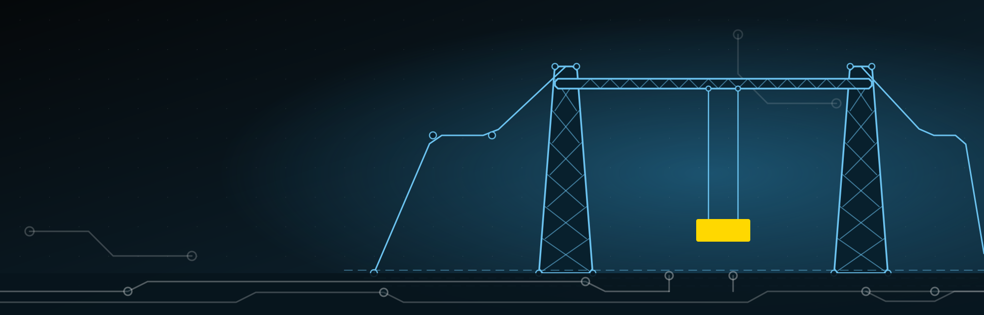 Middlesbrough
 Darlington
 Newcastle
One drawing for every place I cover.
- Dark first. Pages sit on dark backgrounds.
- Cyan for lines, white for text.
- One yellow detail per page, and every button.
- Same size, same style for every drawing.
Swipe or scroll sideways to turn the pages.
Having the rules written down means a new location page is quicker to make, and it looks like it belongs with the rest of the site. The two typefaces, Montserrat and Archivo, are both free on Google Fonts.
The idea: landmarks drawn as circuit boards
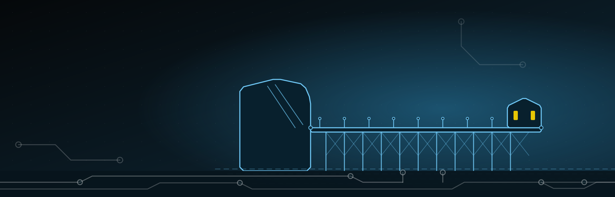
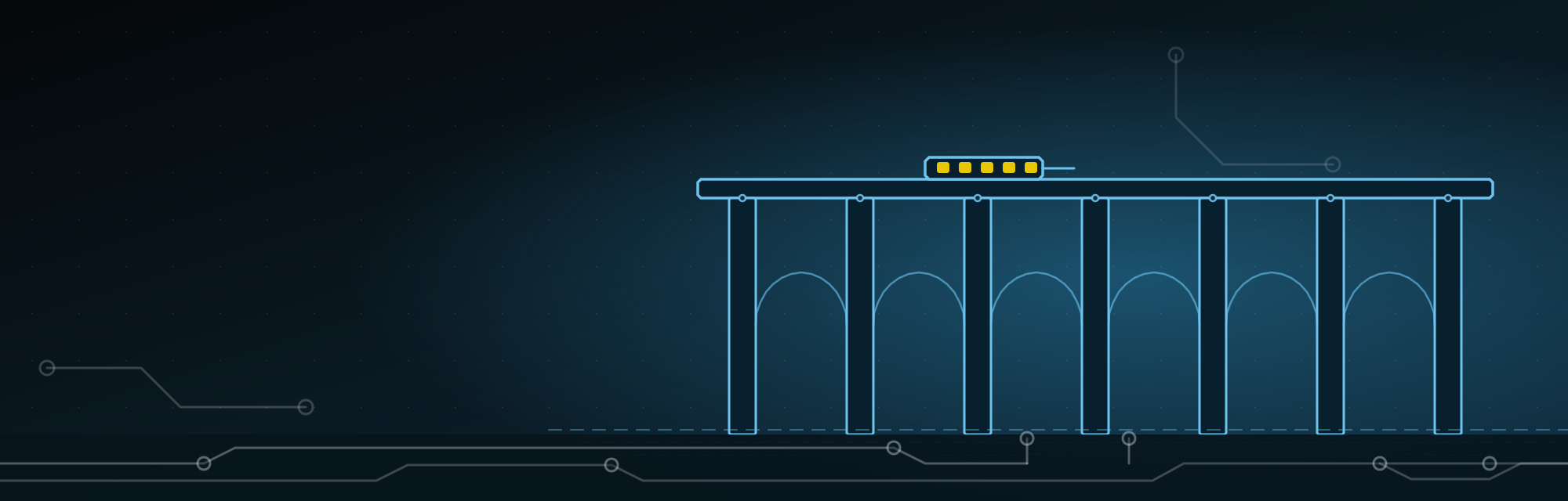
Every location page now opens with a hero drawn like a circuit board. The landmark is built from cyan lines with pads at the joints, traces run off along the ground, and one yellow detail picks up the colour from the logo. The same dark background runs across the site, so every page feels like part of one brand.
Why landmarks
A page about web design in Middlesbrough should feel like Middlesbrough. So the Transporter Bridge became a tangle of traces, Saltburn Pier became a row of legs and cross braces, and the Tyne Bridge became a single sweeping arch. Each drawing links through to its page, so have a look around.












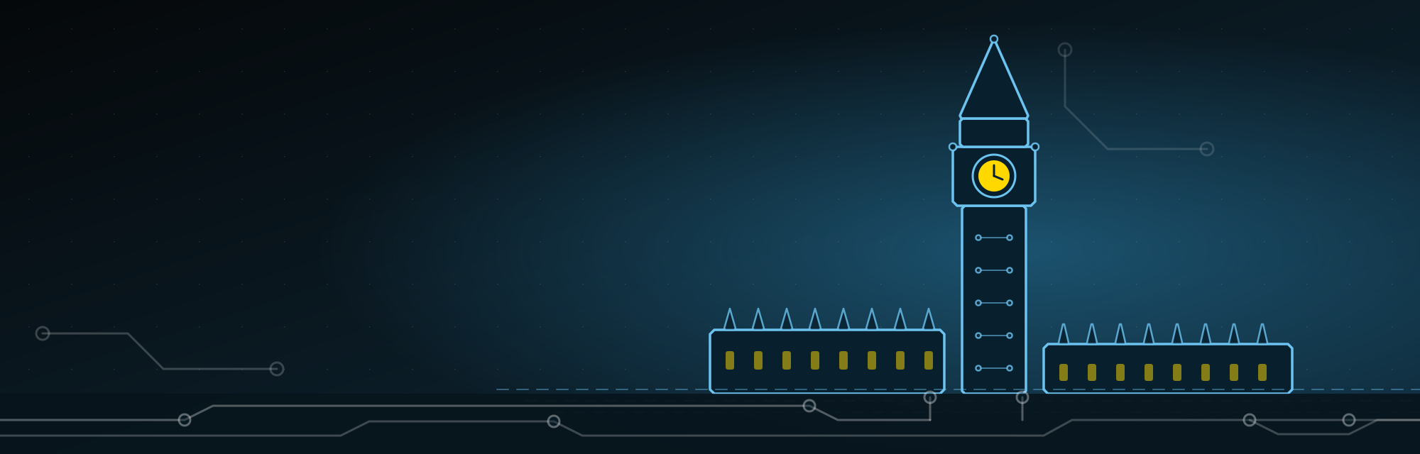
The circuit board details
Where it all starts: the JC logo. Every trace, pad and yellow accent in the drawings comes from this one icon.
Each drawing is built from the same small kit of parts, so the whole set feels like one family:
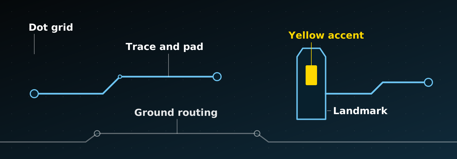
- Traces and pads. Landmarks are outlined in thin cyan lines with ring shaped pads at the joints, the same way the lines and nodes work in the JC logo.
- A circuit board background. A faint grid of dots sits behind every drawing, with a few fainter traces in the corners, like the empty space on a real board.
- Routing along the ground. White traces run underneath each landmark and off the edges of the image, so the drawing looks plugged into the page.
- One yellow accent. A lit window, a clock face or a lamp picks out the yellow from the logo, so the eye goes to one place.
- One size and one style. All 18 drawings share the same dimensions and colours, so a new place can be added later without redesigning anything. They are also tiny files, so they do not slow the pages down.
- A matching icon set. 25 icons for services and contact details, drawn in the same sharp single line style as the logo.
- Corner motifs. Faint circuit traces sit in the corners of sections across the site, so even the plain areas carry the idea.
- The icon logo. On tablets and phones the header now shows just the JC icon, which is the part of the logo that carries the circuit idea best.
What changed across the site
The drawings came with a wider tidy up, so the pages feel consistent from the top to the bottom:
- Consistent heroes. Every landing page opens the same way, and photo heroes are now greyscale so they sit properly against the dark theme.
- Reviews near the top. A short reviews strip with equal sized cards, the stars under the company name, and a vertical list on mobile that is easy to read. Each review links to the matching project.
- How it works. The steps on each service page now reveal as you scroll and respond when you hover over them.
- Smoother navigation. Pages load ahead of time, move between each other with a short fade, and a thin line shows progress as soon as you click a link, so the site never looks stuck.
- A tidier header. The Services and Areas menu is neater, with places grouped into countries, regions and towns, and there is a call icon and a quick call and WhatsApp bar on mobile.
- An enquiry form that matches. The form at the bottom of each page now uses the same styling as the contact page, with the questions people ask most answered just above it.
By the numbers
18 landmark drawings, one kit of parts, and files so small they do not slow a page down.
Technical changes worth shouting about
Most of the work is invisible, but it makes a real difference to how the site feels and how it is understood by search engines:
- Pages load ahead of time. The site now tells the browser which page you are likely to open next, so the click feels almost instant. A scheduled job also keeps the server cache warm every ten minutes, so the first visitor after a quiet spell does not get a slow page.
- Tiny image files. The drawings are SVGs, a few kilobytes each, so they stay sharp on any screen and barely touch loading time. A typical photo hero is many times heavier.
- Questions marked up for Google. Every location and service page now carries FAQ structured data, so search engines can read the questions and answers on the page.
- Cleaner search results. Page titles and descriptions have been rewritten, thin pages are kept out of the index, and the location and service pages link to each other so Google can follow how they connect.
- Instant feedback and smooth transitions. A thin bar appears as soon as you click a link, and pages fade between each other instead of flashing.
- Everything in one place. The styling now lives in one central stylesheet instead of being scattered across pages, which keeps the design consistent and makes future changes quick.
Worth remembering
A brand does not need to be complicated. It needs to be consistent.
What a brand overhaul means for your business
Good branding is not just a logo. It is a small set of ideas used the same way everywhere: colours, shapes, imagery and the way you write. Take one visual idea from your logo and repeat it. Mine is a circuit. Yours might be a shape, a texture or a single line. Consistency is what makes a small business look established, and it costs very little once the idea is settled.
If you would like your own website and branding to work together like this, take a look at my branding and logo design and WordPress web design pages, or get in touch for a chat about your project.